YouTube is the world’s 2nd biggest search engine behind its parent company Google. A third of the population that uses the internet uses YouTube.
While you can’t optimize your way to success, implementing them can still make a significant impact on the performance of your social platforms, especially on YouTube.
When we onboard clients, one of the first things we do is to do an audit and analysis of their social platforms, and we noticed a trend. A surprising majority of clients, even some big companies were not using these 2 basic YouTube tricks and optimizations I’m about to show you.
Spotify isn’t our client, but we do put them on the spot here. Of course I have no idea about the size of your business, but I wanted to show you that there are things you can do to compete even with the biggest fish in your particular industry.
According to YouTube, 90% of the top performing videos on the platform use custom thumbnails.
Custom thumbnails are cover images you can create for your videos instead of choosing the options they give you which are taken from frames on your video.
Why are they so important?
In the modern world where attention spans are shorter than a goldfish and the playing field is full of competition, you need to stand out.
Custom thumbnails do these 2 things which make them vital if you want to increase you click-through-rate and get more video views.
1. GET ATTENTION. STOP THE SCROLL.
Selecting the most intriguing image possible for your custom thumbnail will help your potential viewer take notice. Of course, the image should be relevant to the content of your video. It’s never a good idea to lie or mislead.
2. LET THE VIEWER KNOW WHAT THE VIDEO IS ABOUT.
Why do you watch a video? Because it’s relevant to you! An interesting or eye catching image may stop the scroll, but you may still not get a view if they don’t think the video is for them.
The easiest way is to add text to your custom thumbnail, basically like a headline of a news article. It doesn’t have to be the same as your video title but it should clue the viewer in on what they can expect from watching your video.
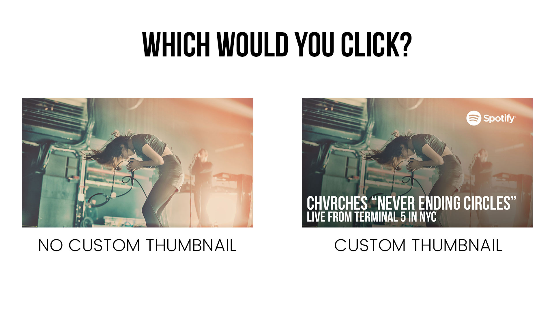
Here is an example below. Which image are you more inclined to click on? Left or the Right?
It’s a cool photo of the band CHVRCHES, but what is it? An Interview? Live performance? Documentary piece? Or what if I like their music but I don’t know what they look like? Would I know this video is about CHVRCHES just by the photo?

End screen annotations or end cards are awesome features on YouTube where you can place clickable links at the end of your video.
Why are they awesome? It allows you to suggest the viewer another one of your videos or your playlists or even allow them to subscribe to your channel.
You ever watch a video on YouTube then realize you binge watched 10 videos in a row? The internet blackhole is real. Why not give the viewer the option to binge your content instead of someone else’s?
The end screen annotations work best when you suggest a video that’s close in content to what they just watched, there is even an option to let YouTube suggest one to them based on their behavior.
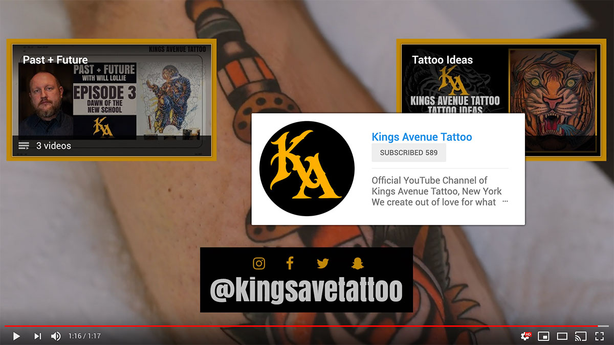
Below is an example of an end screen annotation with options to check out 2 playlists and subscribe.

